In Singapore, “white” is never just white. It’s a bit of a chameleon that can look crisp on a swatch, then shift once it meets bright tropical daylight, warm evening LEDs, and all those reflective tiles and glass surfaces doing the most. In compact HDBs and condos, all that bounced light can make a white read a little grey, turn slightly yellow, or look unexpectedly dull.
Perfectly suited to minimal, Japandi, Scandinavian, and modern tropical homes, “Cloud Dancer” is a soft, airy white that feels calm and bright, especially alongside light woods and natural textures. Want to pull off the “Cloud Dancer” look? Browse Berger Paints’ Whites and Grey palette and shortlist a white that suits Singapore’s mixed lighting and works with the features you can’t change, like flooring and carpentry. This post aims to guide you through reading undertones, testing whites in Singapore’s shifting light, and keeping white walls warm and layered with the right sheen and accents.
Chasing The “Cloud Dancer” Vibe: How To Find The Right White For Your Interior Wall
1) Start with the “Cloud Dancer” brief
“Cloud Dancer” is all about a soft, airy white that feels calm and bright, without looking clinical or overly creamy. Before you browse shades, decide the mood you want the room to have in both day and night lighting.
- Aim for: soft, quiet, easy-on-the-eyes white
- Avoid extremes: ultra-crisp (can feel harsh) or too-warm (can feel heavy)
- Keep the goal: a white that stays pleasant from morning to evening
2) Factor in Singapore’s light and reflections
In Singapore homes, whites shift because daylight is strong and reflections are everywhere. Glossy tiles, glass, and polished stone can bounce light and tint the walls, making a white look cooler, greyer, or just a bit washed out. Then at night, warm bulbs can push the same shade warmer.
Note:
- Daylight can cool a white down.
- Warm LEDs can add a creamy cast.
- Reflective surfaces amplify undertones.
3) Choose by undertone, not by “how white” it looks
Two whites can look identical on a chip, then behave totally differently once they’re on the wall. Undertones are the subtle colour cues (warm, cool, or neutral) that show up more on large surfaces. If you want a white similar to Cloud Dancer, you should be in the “balanced neutral” zone.
Quick tips:
- Compare samples against a sheet of true white paper.
- Check if it leans: yellow/pink (warm) or blue/green (cool)
4) Let your fixed elements lead
Floors, tiles, countertops, and built-ins don’t change easily, so your white should complement them. Warm wood and beige stone tend to like softer, warmer whites, while grey tiles and black accents often sit better with cleaner, cooler whites. When undertones align, the whole room instantly looks more intentional.
Quick Tips:
- Match the white undertone to the flooring tone first.
- Consider cabinetry laminates and countertop veining
- Use curtains and large furniture as supporting cues.
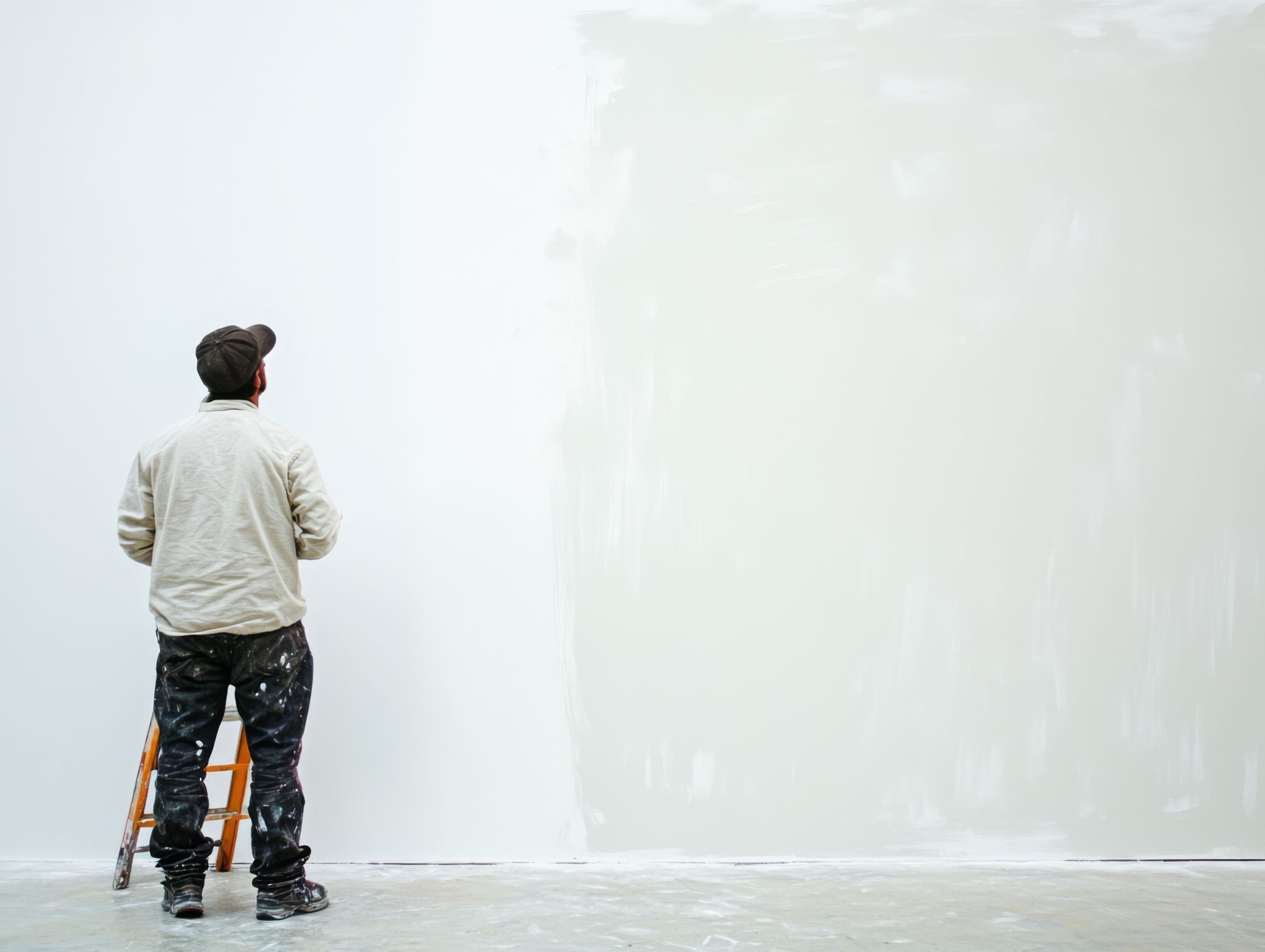
5) Test properly (big patches, real timing)
A small swatch is a tease, so test your shortlisted whites on the actual walls. Paint two generous patches on different walls and check them in the morning, late afternoon, and at night with your usual lights on. This is where you’ll catch the “why does it look grey here?” surprises.
Quick tips:
- Paint patches at least A3 size (bigger is better).
- Test on two walls (one near the window, one deeper inside).
- View in daylight + lights-on nighttime.
6) Use finish to create depth, not just colour
If white looks flat, it’s often because everything has the same sheen. Matte can be beautiful and soft, but pairing it with a slightly higher sheen on trim or doors gives the space definition. Finish is your secret weapon for a layered look without adding another colour.
Suggestions:
- Walls: matte or low sheen for softness
- Trim/doors: satin or semi-gloss for crisp definition
- Same colour, different sheen = instant dimension
7) Prep matters because white is unforgiving
White shows texture, patches, and uneven absorption much more than deeper colours. Hence, smooth the wall properly, fix hairline cracks, and don’t skip primer where needed. A water-based primer helps create an even base so your white top coat looks consistent, not blotchy.
Quick tips:
- Fill and sand for a smooth surface.
- Prime over strong colours, stains, or fresh plaster.
8) Add “Cloud Dancer” warmth with texture and soft contrast
A white room doesn’t need bold colour; it needs layers. Natural textures like linen, rattan, light timber, and woven rugs keep the space warm. Add one deeper “anchor” element (black metal, darker wood, charcoal accents) so the white reads intentional, not unfinished.
Suggestions:
- Texture: Add linen, timber, rattan, bouclé, or jute to give white walls warmth and depth.
- Soft neutrals: Mix in sand, putty, or warm greige shades to add gentle depth without changing the mood.
- One anchor: Add a grounding touch like dark wood furniture or matte black accents for clean, confident contrast.
9) Pick whites by room function
Living rooms face the most dramatic light changes, so choose the most balanced white there. Bedrooms can handle a slightly softer, warmer lean because they’re often lit with warm lights. Kitchens and corridors benefit from more wipeable finishes without turning shiny.
Colour is only half the story; the product and finish matter just as much for durability and maintenance. When choosing interior paints in Singapore, think about humidity, cleaning habits, kids/pets, and whether the area gets scuffs. The right paint solution helps your white stay fresh for longer.
- Prioritise durability for hallways and kids’ rooms.
- Consider washability for dining areas and near switches.
Still not sure where to start? Browse Berger Paints’ White and Grey palette for a curated range that runs from crisp whites to soft neutrals. For a clean, modern look, you can go for options like Absolute White L161 or Innocent White L180. If you want the closest match to that calm “Cloud Dancer” vibe, opt for shades like Cotton Wool L104 or Angel Cloud L123, and for a cosier, more welcoming mood, consider gentle warm whites like Old Lace 950 or Sour Cream L166.
Conclusion:
The “Cloud Dancer” effect comes from whites that stay gentle and balanced from sunlit mornings to cosy nighttime lighting. Test a few options on your walls, then let undertone and finish work together to give you whites that feel warm, layered, and intentional. Ready to find your match? Explore Berger Paints Singapore’s Whites and Grey palette, shortlist your favourites, and try them at home in real lighting.